API: Usability & Design
BoomTown Real Estate CRM
BoomTown had dumped a bunch of their API information into Slate and wanted help getting it ready for customer eyes.
For this project I went back to my technical writing roots to streamline and ready the contents. But let’s face it…who ever sits down to read an entire API? Nobody. Programmers don’t. They just want to be able to jump right to the reference or example they need.
I used my UX/Product Designer experienc to make sure that we tweaked the solution as best we could for usability and navigation. I met up with some local developers for coffee (okay..yes, one was a Zoom meeting since he was on travel). From interviewing them and watching them attempt to navigate the API, I got some insight around some minor adjustments I could make to make this API a nicer experience.
I implemented:
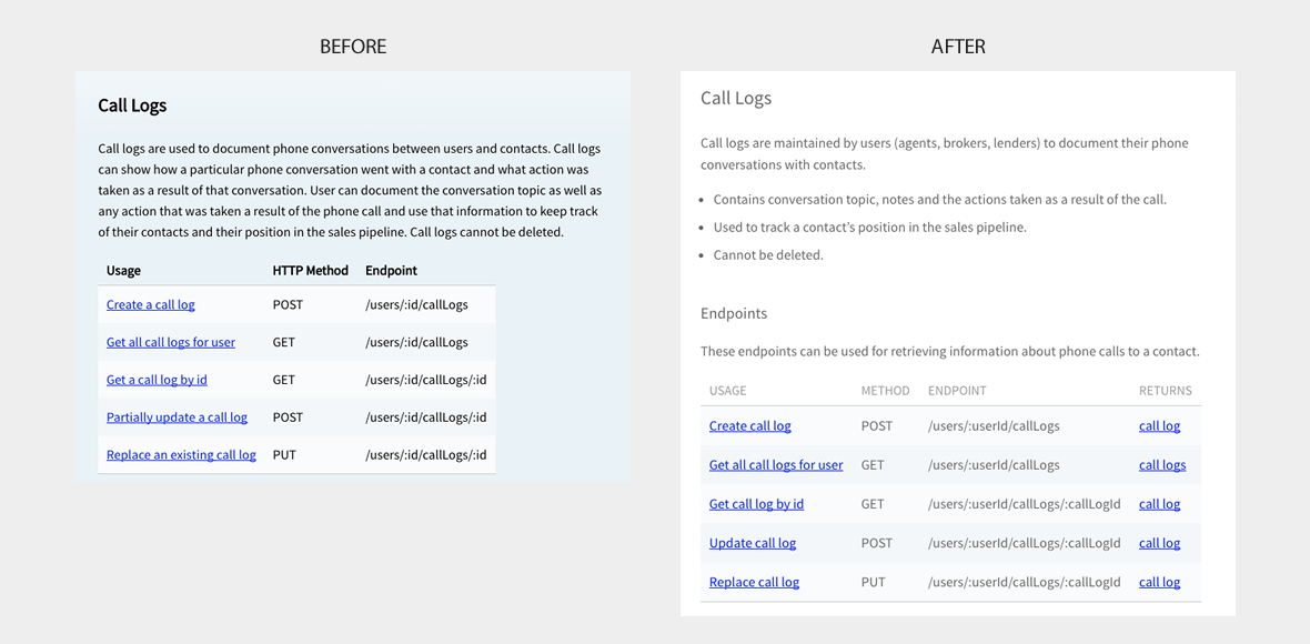
- Linking from Endpoint summary tables to endpoint sections in two places (usage and returns values).
- Incorporating lookup values right where that property is defined (vs in separate tables requiring additional clicks).
- Standardizing how request parameters are presented (in tables for quicker reference) with a link to a section explaining default values.
- Subtly updating CSS styles to help eyes go to the information that matter most. BoomTown branding was incorporated whenever possible by taking color and font values from BoomTown’s company website so the API would feel a bit more like an asset belonging to this company, rather than something just using a template.
- Linking to objects/sections and relevant sections.
- Linking to external resources.
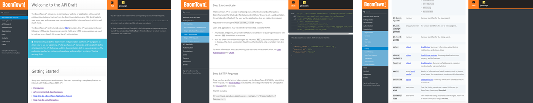
BoomTown API Screen Shots
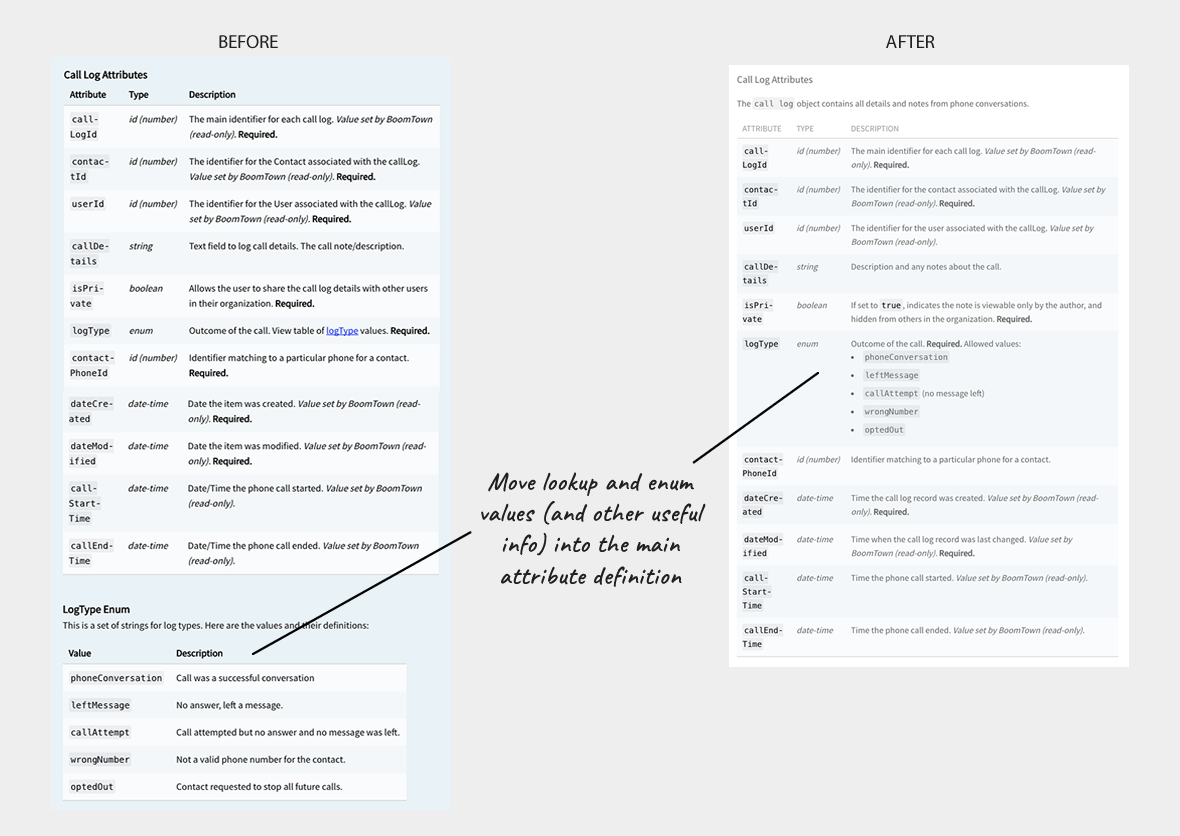
Rolling Enum Values into Attribute Definitions
When I took over the API draft from the initial developers, enum/lookup values were listed in separate tables from their attribute definitions. I rolled this information into the main attribute table. Now, all information about an attribute is in one place and didn’t require additional clicks to learn more. I also applied what they call a “targeted documentation” strategy where a value’s definition was only provided when it was something that wouldn’t be obvious. Additionally, I updated CSS and coded attribute names so they would stand out…especially in descriptive content where it would be extra helpful when scanning content. All these became standards throughout the documentation.
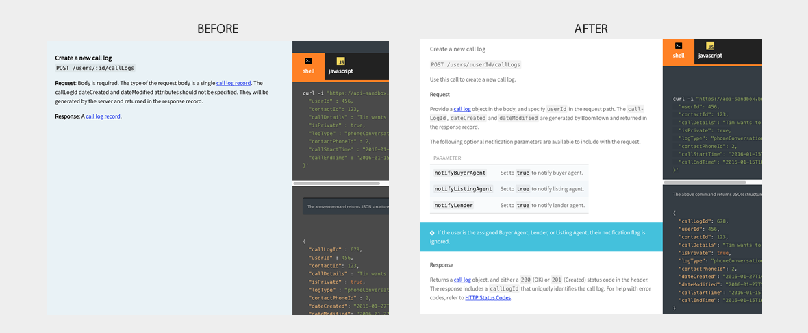
Usability for Endpoint Summary Tables
In usability testing, I found that it was useful for the programmers to be able to see at-a-glace what the endpoint would return…be it an object, an array of objects, or a status message. There was also a tendancy to want to click there to see an example, so I linked the Returns for them to jump down into the section.
Improving Endpoint Description Sections
Who wants to read a glob of info to tell what is supposed to happen? The easier anyone can scan something, the faster they can get going. I made sure we told exactly what needed to be provided in the request (with hyperlinks back to object attributes), as well as what should be expected in the response. Any kind of request parameters (paging, ordering, selecting and other) were pulled out into quick reference tables, with links to API standards when applicable. Tips and warnings are styled to get attention, and response information links back to API standard error definitions.