Homeopathy Course: Usability & Responsiveness
Lisa Hawkins, Owner of The Energy Evolution
Lisa Hawkins spent a fair amount of time writing and compiling information for an online course for her homeopathy program.
The course teaches the foundations of homeopathy but also includes a large library of resource information (remedy lookup, plus how to handle first aid and theraputics).
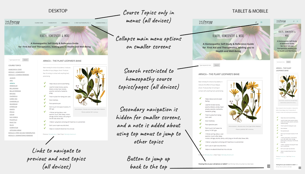
At this point in time, it didn’t make sense for Lisa to invest in an expensive courseware product, so we used her WordPress site to serve up the course pages, and a low-cost program to handle permissions. I put in code that switched the menus from the main site navigation, to course topic navigation.
Since this was a self study program and also served the purpose of a reference guide/library for users, we didn’t need the functionality that releases content step-by-step. Instead, on the desktop, we went for secondary navigation in the left sidebar. However, on smaller devices, this left sidebar just got in the way…who wants to scroll down that much to reach the content? Nobody. So, I hid the left sidebar and for mobile users, we remind them at the bottom of the page to go back to the top menu to navigate (with an arrow button to bounce them back up). There is also a context-sensitive search box that they can use to locate the content they need fast. And at the bottom of each page, included are Previous & Next links.
Video Screen Capture
Want to see more about how this site adapts for different devices?
This video shows how the course pages adjust with each device size going from desktop, to tablet, to mobile.
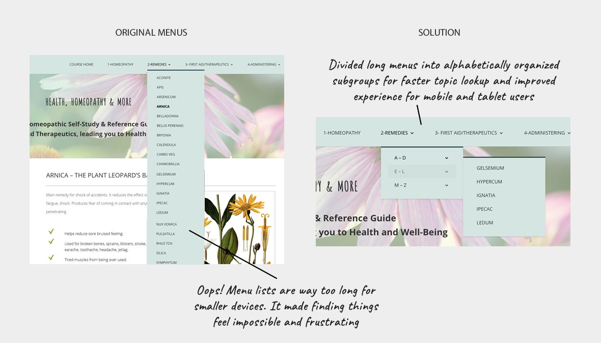
An Unexpected Navigation Issue…Solved!
One of the problems we ran into during testing were long menu item lists. Because there is so much reference material and a detailed page for each remedy, our menus got way too long. In testing, I found these impossible and problematic for tablet and mobile users. To solve this issue, I broke these options/topics into alphabetical groupings.