NetIQ: UX for Enterprise Level Software Solution
Operations Center: Enterprise Level Software with that solves a ton of problems for large corporations
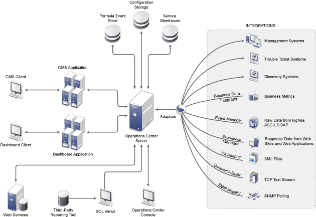
Operations Center is enterprise level software that helps corporations to manage disparate network management systems. I provided UI/UX design for this solution for 12 years. It was a robust solution that solved very complex problems in super customizable ways. Back in 2001, it was created by Managed Objects, later aquired by Novell, and then Attachmate NetIQ. It is now owned by Micro Focus.
User Analysis / User Personas
Mobile App Design
Identity Manager Integration & Charting Summary Widgets
Dashboard Charting Portlet
Portlet Configurations Overhaul
“I’ve had the pleasure to work with Janet off and on for close to 15 years. Janet is a UX designer, graphic artist, developer and documentation specialist. She has an uncanny ability to create compelling intuitive user interfaces and designs. I have continuously sought out her consulting services to help design and build web based applications, mobile applications, desktop applications and documentation services. One of the many of her strong traits is her ability to quickly deliver on her work. She is a hard worker and consistently churns out her deliverables right away. Janet is a pleasure to work with. She is collaborative and willing to listen to good ideas. Her experience and intuition allow her to see through the fog of what you may be asking for and ask the right questions to deliver what you really want. I would highly recommend her to anyone looking for an expert at UI/UX design, graphic artwork, development and documentation services.”
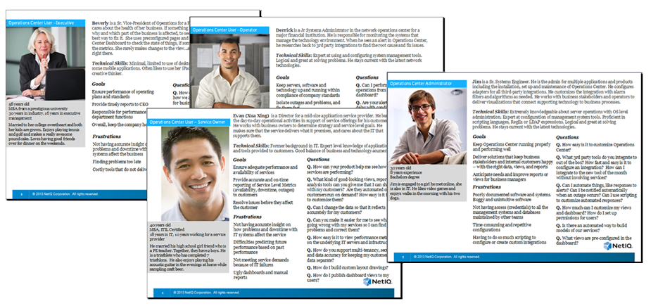
User Analysis / User Personas
User analysis resulting in a set of 4 personas that described our main user types
The Operations Center software platform has multiple types of users from the corporate executive who uses dashboard reporting, all the way down to the systems operator who manages hardware and software in the enterprise environment.
This project included:
- Interviews and feedback from current customers as well as internal stakeholders: Product Owner, Sales, Service Consultants, Support, Team Managers
- User Analysis with Product Manager
- Review with development team to refine, tweak, and finalize user archetypes
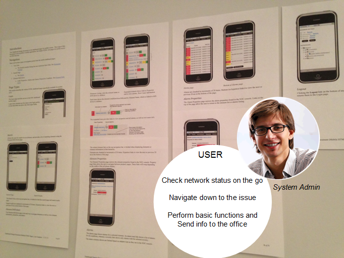
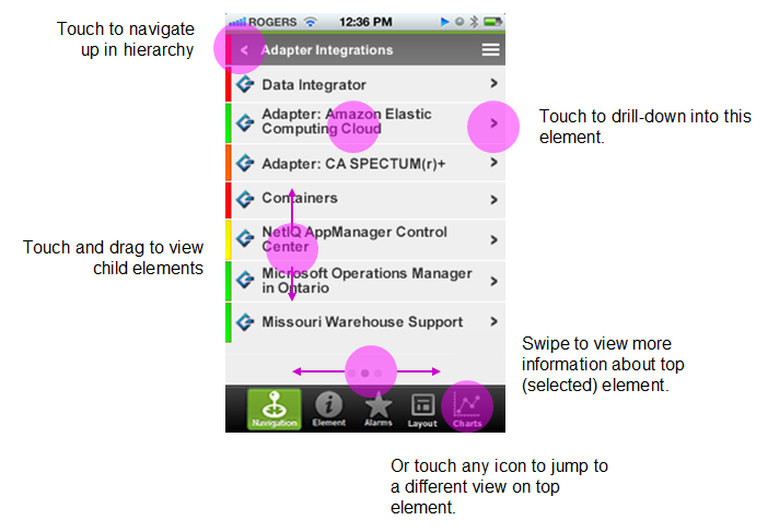
Mobile App for Android and iPhone
NetIQ Operations Center: Building a Mobile App for Administrators to monitor status and alerts
Operations Center is enterprise level software that helps corporations to manage disparate network management systems. In this project, we were tasked to design and build a mobile application for administrators to review status, information and alerts about their network objects.
- At first glance, the functionality of this mobile app felt easy and clear cut — allow administrators to view network object status, review various types of data and alerts, and perform basic actions.
- But, we had more than one tricky thing to solve. Such as providing a way for our mobile administrators to navigate through any number of object hierarchies with unpredictable depth, and then to be able to stop and view object information or take actions on alarms.
- Initially, management wanted to develop an HTML version because of limited resources. I put together graphical mockups and coded up a basic prototype (HTML & JavaScript) for initial team and user testing.
- A couple of years later, we got the “go ahead” to develop a mobile application. As a team, we went back and forth, testing various navigational flows to give the best experience for navigating long and deep hierarchies. At times we disagreed, but as with any project, our design improved and our concept advanced. Shown below are notes from a brainstorming session and design documentation.

Team Brainstorming Notes
Iterations of documentation for visual design elements, interaction design and team decisions
High Fidelity Mockups (v1) and Notes
Draft Mockup with Mapping of Mobile Gestures
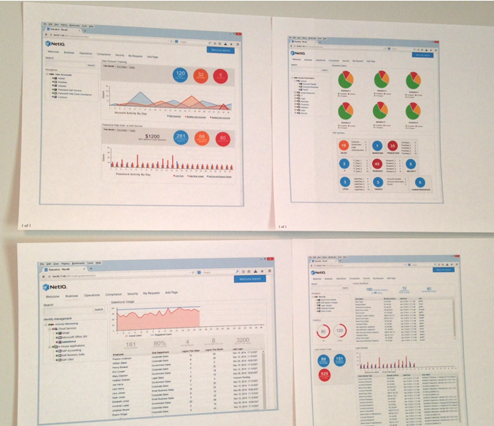
Identity Manager Integration & Charting Summary Widgets
A project for Identity Manager customers that ended up improving our product for all users…
One of the best things about the Operations Center product is there was a way to integrate with nearly any other system out there. Bringing all your data into one place…very handy if you have disparate network management systems and information in various databases. It’s a great tool for figuring out how your technology is affecting your business environment.
Recently, I worked on an integration project with Identity Manager (IDM), designing a series of seven dashboard page layouts customized to main user roles/types: Manager/Executive, Compliance, Help Desk, Risk Assessment, Operations and End User.
- I interviewed customers to initially identify the feature set for each user role. I worked with solution experts to design the page layouts and the various components.
- My high-fidelity mockups were shown to customers to get their feedback.
- Out of this project came new summary widgets that summarize data in a different way, and have been integrated and delivered as part of the Charting Portlet used by all dashboard customers.
Dashboard Charting
New Charting Portlet provided upgraded capabilities and an chance to do things differently…
The Operations Center Dashboard had been around for many years and was used by many of our customers.
However, the charting functionality was getting pretty “old school” and it was high time that we updated it to something far more sexy. In this project, we integrated Highsoft’s Highstock charting package to provide gorgeous timeline charting of performance and service level metrics.
In the past, all the dashboard portlets were configured from a portlet’s preferences page — with few or any options available on the “view-side” when the portlet is being actively accessed by the user. This was the perfect time to break with tradition and give the user more control at their fingertips and making configuration options easier to access.
Customer Interviews.
With a possible set of over 200+ options, we didn’t have the budget or man years to deliver everything and the kitchen sink. It was important to identify our MVP (Minimum Viable Product). I interviewed existing customers to find out what features they used the most, what was helpful them and what wasn’t.
Getting to Minimum Viable Product.
As a team, we had a long discussion in regards to what should be included in the charting upgrade, and which configuration options should be available in a new “view-side” control panel. Then, I paired the list down from 200+ possible configuration settings to a much more deliverable subset. Any that gave the user more control on data and formatting was included, and those more apt to be used by administrators were kept on the preferences page.
Make Display Options Easily Accessible.
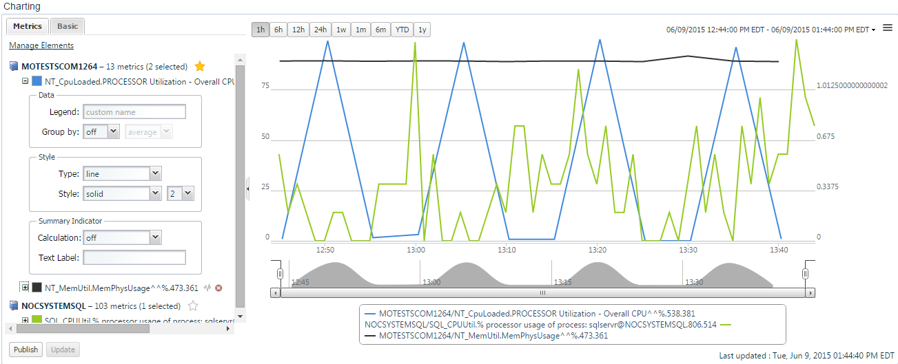
Mostly customers wanted to look at performance in certain types of intervals back from the current day/time. I gave them new incremental buttons to make it easy for users to jump to a specific time bands of 6 months, 1 year and YTD. A calendar selector was accessible from the date range to make custom selections.
A left panel that could be collapsed for reporting, or expanded for configuring housed configuration options.
- Style settings were grouped with each metric for full user customization.
- Additional basic settings give users control of chart attributes that you might set once and rarely change again like titles, setting thresholds, hiding/showing features and auto-refresh.
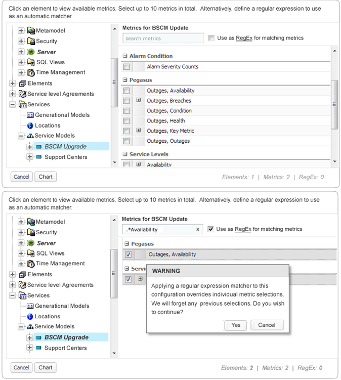
Selection of Metrics, Individually or By Regular Expression.
I designed a two panel solution in lieu of a multi-page wizard that allowed the user to select multiple metrics on one or more objects. As an alternative, there needed to be an elegant way to specify a Regular Expression to auto-select elements.
- Selecting an element in the left panel, lets them view and select metrics in the right.
- An option to specify a Regular Expression provides an override manually selected metrics. Useful for when the charting portlet was being “driven” and the element was dynamically provided from a selection by the user elsewhere on the same page.
Prototypes & Usability Testing.
Throughout the project, I put together various types of prototypes that were tested for usability with our customer base to get feedback and validation before development got too far underway.
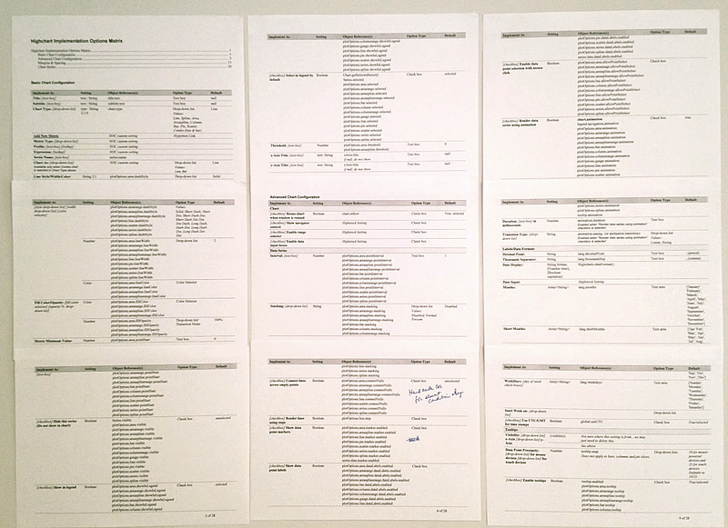
Options Matrix to assist Developers with Implementation
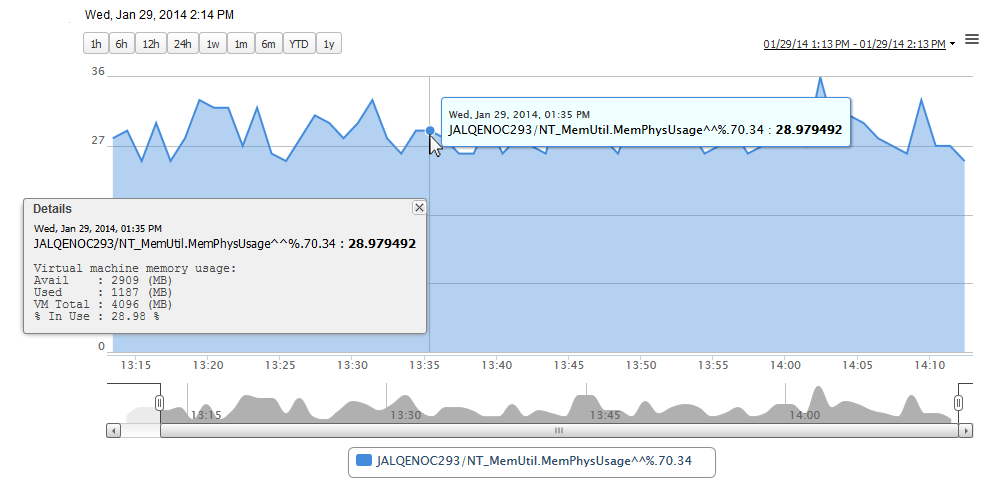
Charting Portlet showing Tooltip Information
Charting Portlet Showing View-Side Configuration Settings
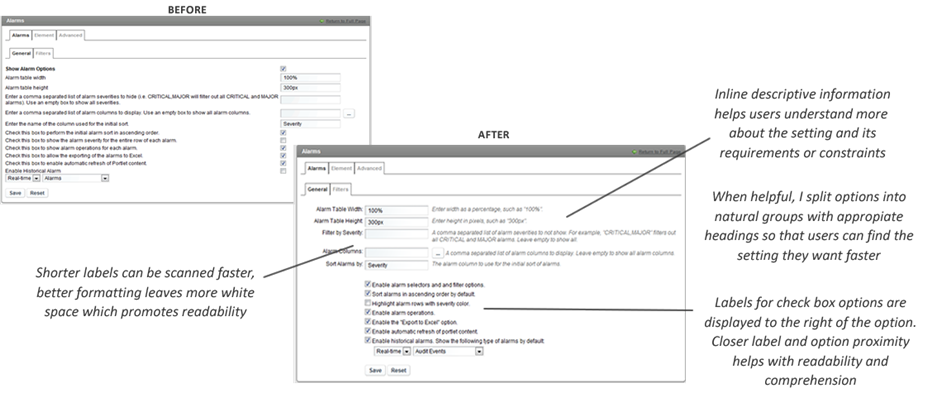
Portlet Configurations Overhaul
NetIQ Operations Center: Transforming dashboard configuration settings into organized, more user friendly forms with inline user help
We had a great dashboard with a library of portlets that exposed data from Operations Center. In the past, the developers implemented edit-side configuration settings for the portlets without any design help…well, let’s just say they ended up as a complete mess.
- Visually these configurations felt overwhelming and much more confusing than they ever needed to.
- Management didn’t have resources to allocate towards implement an integrated help solution. So, I presented a low budget, big impact solution, and personally coded the HTML and CSS changes. View my mockups and design document for these changes.
- I streamlined approximately 20 configuration pages into a logical, organized and user-friendly layout, researched effective labels, and added section headings when options could be divided into groups. When necessary, I added inline notes to assist the user in configuring options without having to refer to the formal documentation.